hi all- sorry for the late assignment post!
as gone over in class, this week each of you will be choosing 2 other group's festivals and creating a single small collatoral piece for EACH group. anotherwords, each person must bring in a total of 2 pieces.
you may choose from the postcard, t-shirt, CD sleeve + CD, or you may do a 16x10 poster. each item MUST have the festival name/identity, its dates & location, and line-up. you may use other info, such as song lyrics, if you like. make sure to collect the proper typefaces & imagery from each group you choose.
good luck.
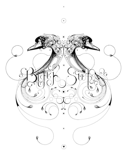 Si Scott is an amazing designer who incorporates elegant, fine lines into beautiful curvatures. His color palette only circulates around black, white and the grays, a symphony created with the splashing of the lines. It is absolutely stunning to see how the monochromatic gray scale can be played in such a dynamic way.
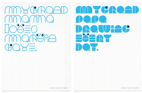 People consider Jonathan Calugi's works to be more of a feminine style. I see his works as inclusive because they are able to embrace a large realm of audience. One has to go under a chain of serious practices before he reaches the simplest geometric adornment. That is why difference exists between the cuteness created by a children and that of a designer.


